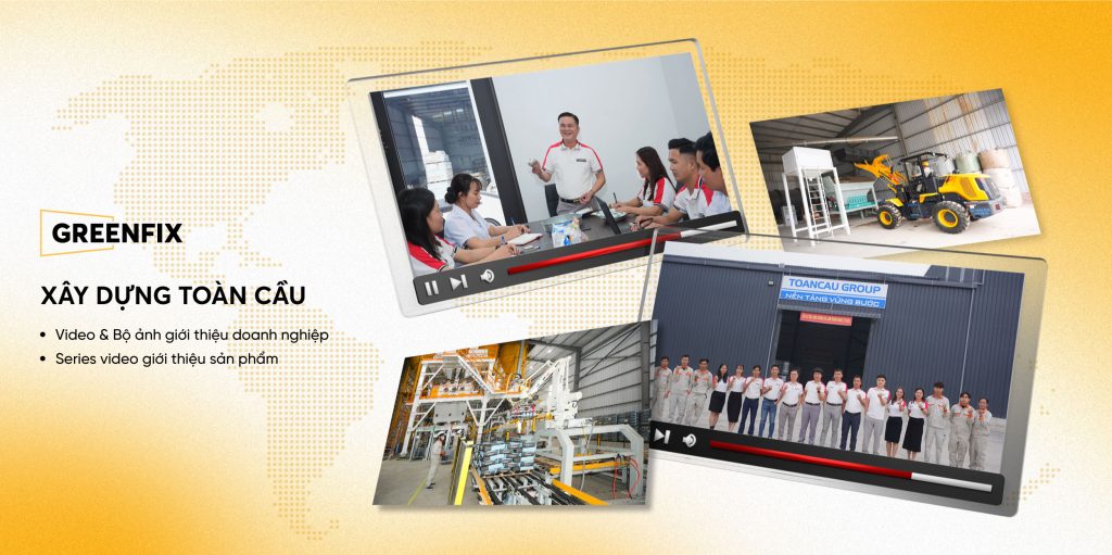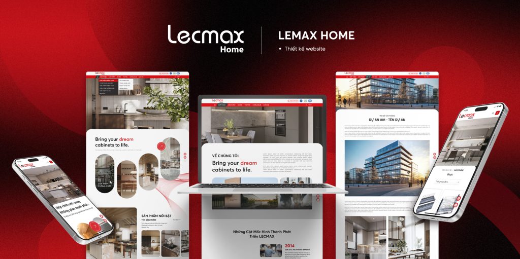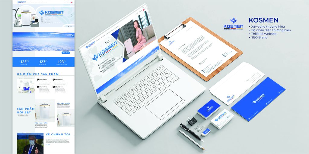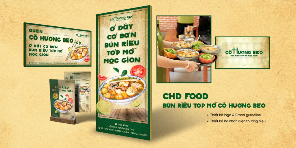
FINDIRECT
- Brand Foundation
- Brand Identity
- Commerce
- Social Media
FinDirect provides auditing, financial consulting, and valuation services for businesses. In an industry where high standards and consistency are critical, the brand required a clear, coherent, and sophisticated identity to convey transparency, credibility, and long-term commitment.
Guided by these principles, VSS Corp developed the brand identity around FinDirect’s core values: accuracy – security – sustainable growth. The logo and brand guidelines were designed with meaningful depth, while maintaining simplicity and modernity, perfectly suited to the professional environment of the financial and auditing sector.
IMPLEMENTATION DETAILS
 |
 |
The infinity symbol and tightly connected geometric structure represent FinDirect’s long-term, sustainable growth vision and the company’s scalability. The enclosing circle conveys a sense of stability and completeness, while emphasizing unity and long-term commitment.
The letter “D” signifies both “Develop” and references the company’s leadership, creating a unique identity mark with long-term applicability. A navy blue and metallic accent palette was chosen to convey trust, professionalism, and modernity, aligning with the standards of the financial and auditing sector.
Based on this positioning, VSS Corp developed a comprehensive brand guideline, covering logo standards, color palette, typography, and application systems, ensuring consistency and cohesion across all brand touchpoints.
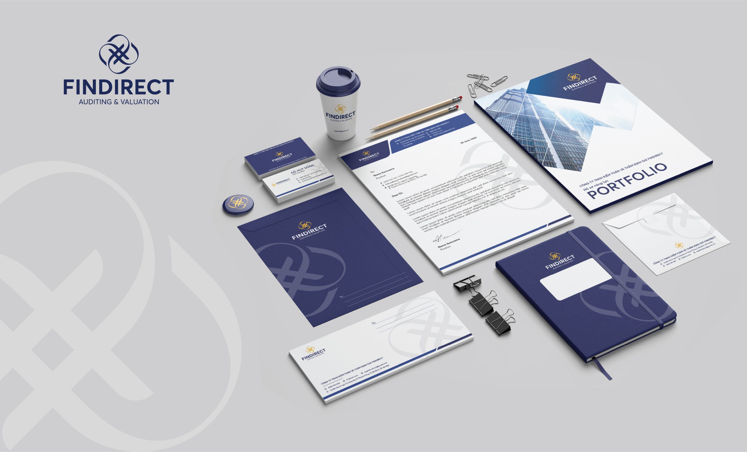
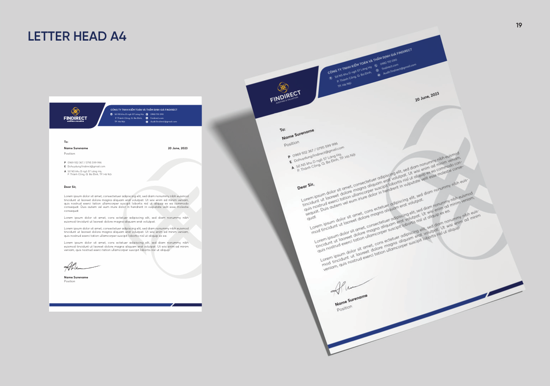
2. Office Identity System Design
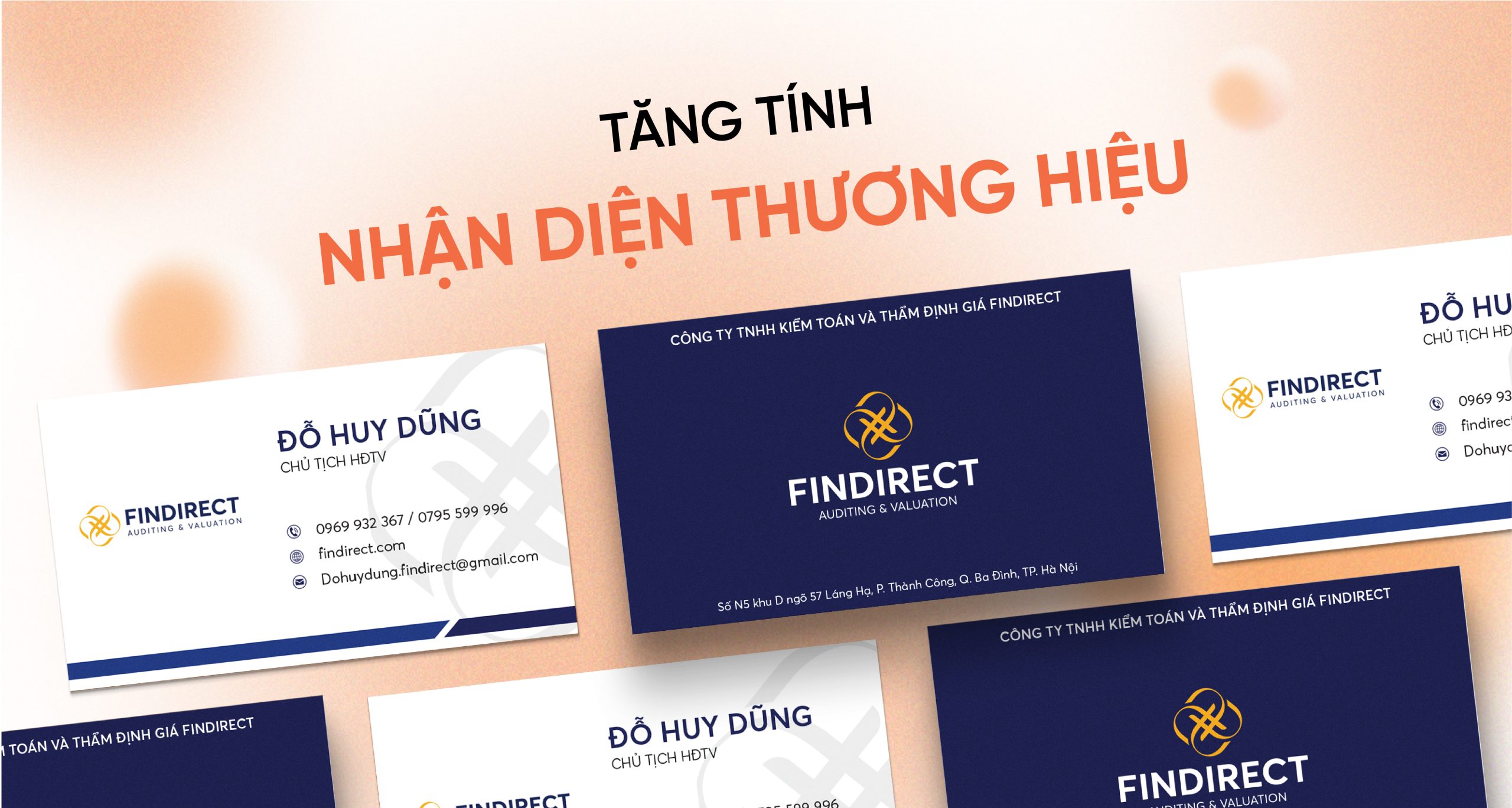
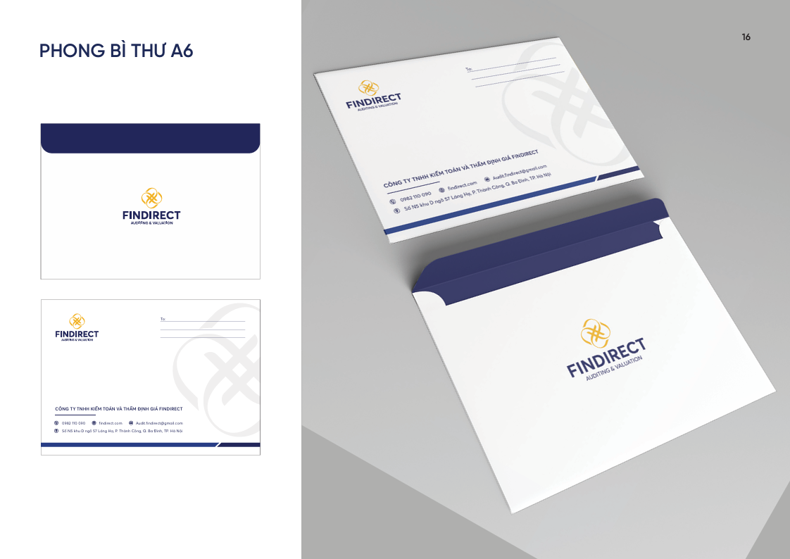
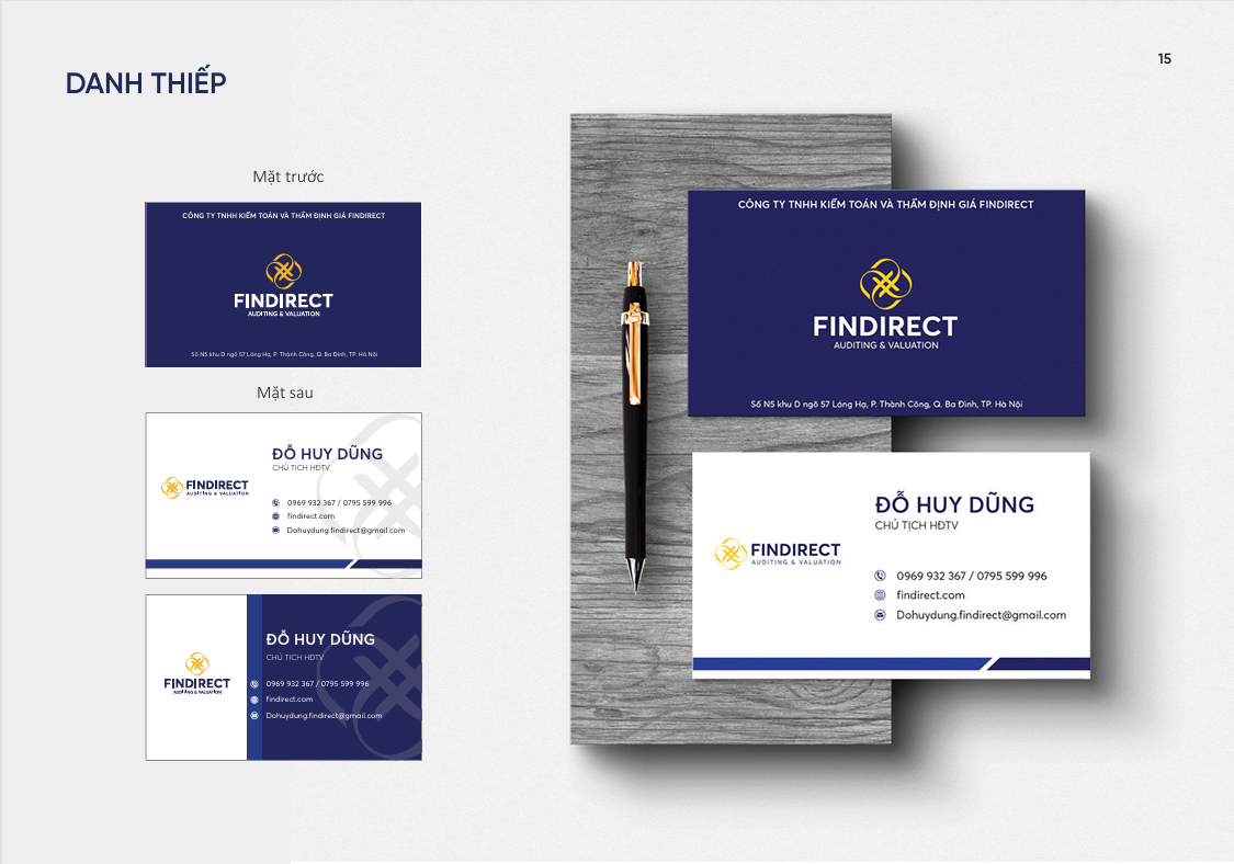
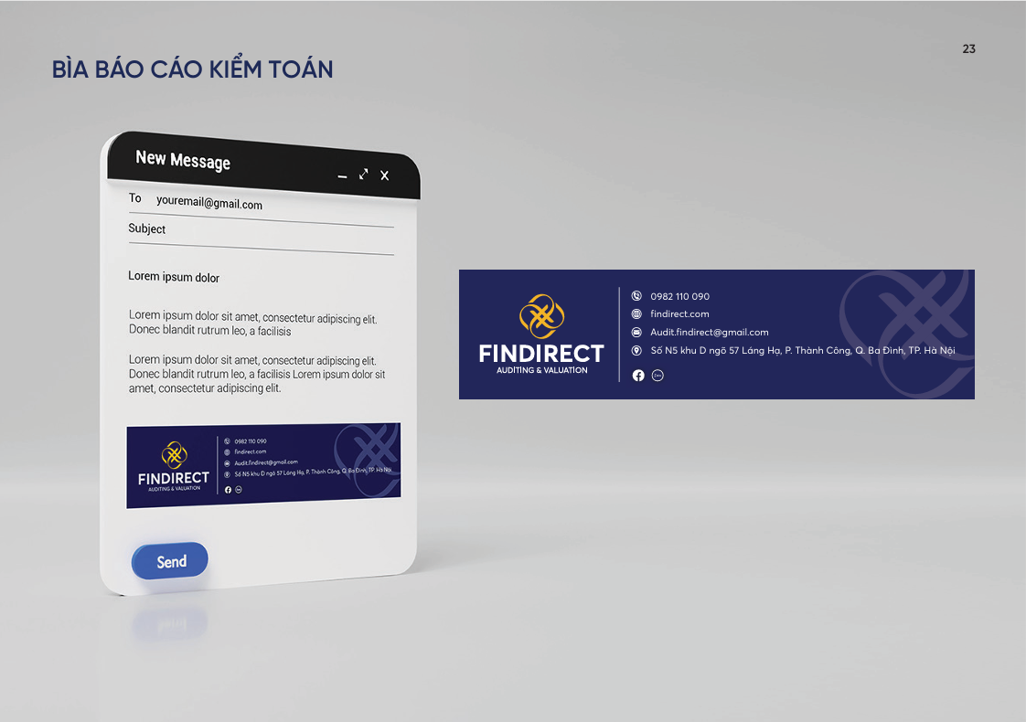
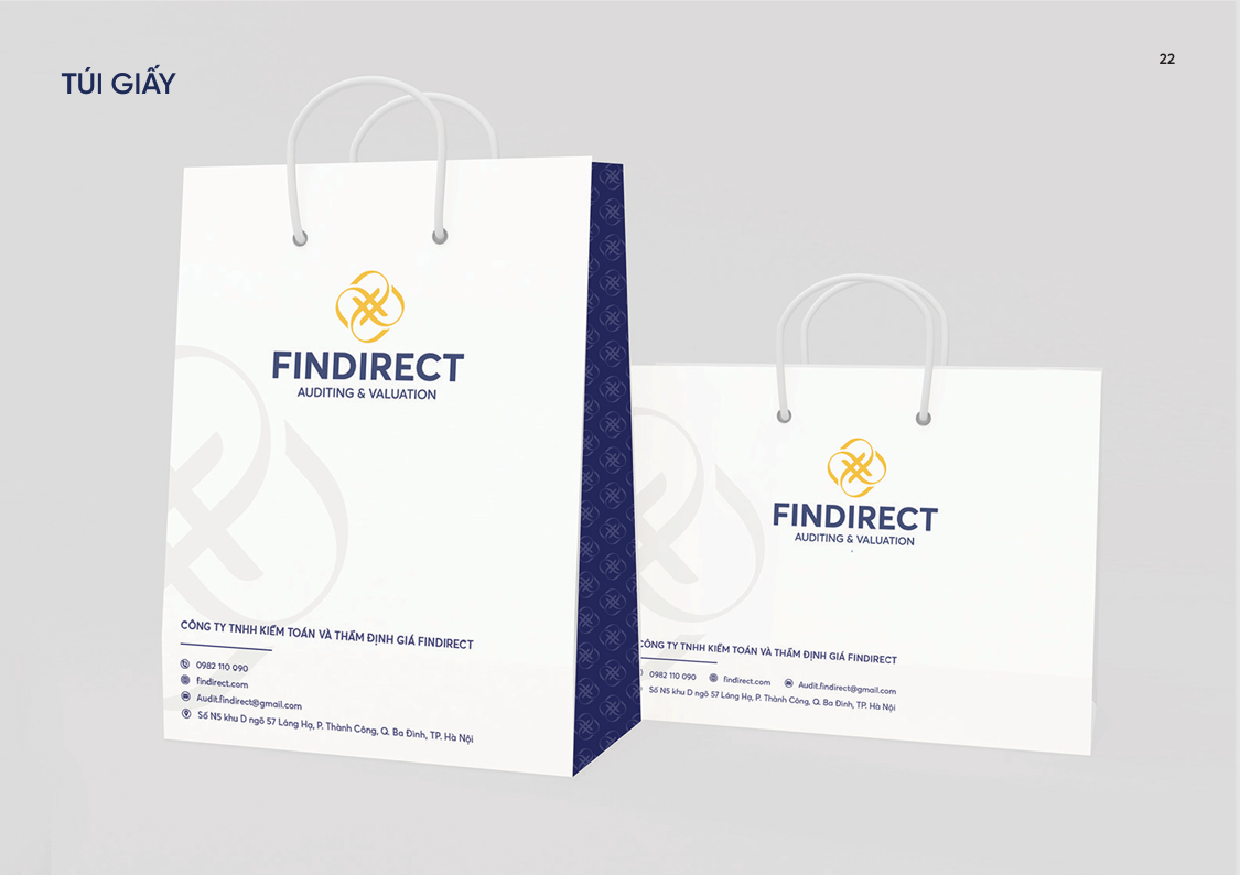
Building on the core brand identity, VSS Corp developed a professional and minimalist office collateral system, tailored to the financial sector, which values clarity and coherence. Documents such as business cards, letterheads, forms, contracts, employee ID cards, and signage were all designed to follow the same visual standards: clean, legible, and precise in communication.
The system is standardized for flexible use in both internal and external communications, helping FinDirect project a consistent and trustworthy image to clients, partners, and regulatory bodies. The disciplined approach to layout, color, and structure ensures a modern, cohesive office identity that effectively supports daily operations.
 |
 |
 |
 |
 |
 |